Using data-driven design to cut onboarding time by 4× and boost engagement by 26% for a fintech platform
Role
Senior Product Designer
Team
Product Growth
Duration
Jul 2021 – Sep 2022

Summary
During Aspire’s transition from Series A to B, I joined as the 4th designer and helped scale the product experience and internal operations. I was embedded within the Product Growth team, where we owned the complete funnel—activation, adoption, and monetization.
My work included redesigning onboarding, homepage, and bill pay, launching the first subscription plans, and leading multiple UX enhancements across login, personalization, and team management.
These initiatives reduced onboarding time by 4x (from 2 weeks to 2–4 days), improved feature adoption by 26%, and laid the foundation for scalable UX across Aspire’s web and mobile experiences.
The challenge
Aspire was rapidly evolving—new features launched monthly, but core UX infrastructure lagged behind. New users struggled with onboarding and discoverability. Key growth levers like pricing, personalization, and notifications were fragmented. As product complexity grew, we needed scalable, data-informed UX to drive real outcomes.
My role
Part of the cross-functional Product Growth pod (Design, PM, Eng, CX)
Full ownership of scoping, designing, and validating solutions
Drove UX execution for growth experiments, bill pay MVP launch and monetization
Mentored 2 designers, interviewed 15+ candidates, and supported hiring scale from 4 to 12
My Process
I followed a consistent end-to-end process across most initiatives:
Audit friction points using analytics (Hotjar, Smartlook) and user session replays
Triangulate with CX tickets, CSM insights, and support logs
Map user mental models, edge cases, and lifecycle stages
Sketch and prototype multiple approaches, validate via internal reviews and user calls
Collaborate with PMs and engineers to scope and launch MVPs
Measure impact post-launch and iterate for polish
Key projects
Project 1
🧭 Onboarding Revamp
What Was Broken
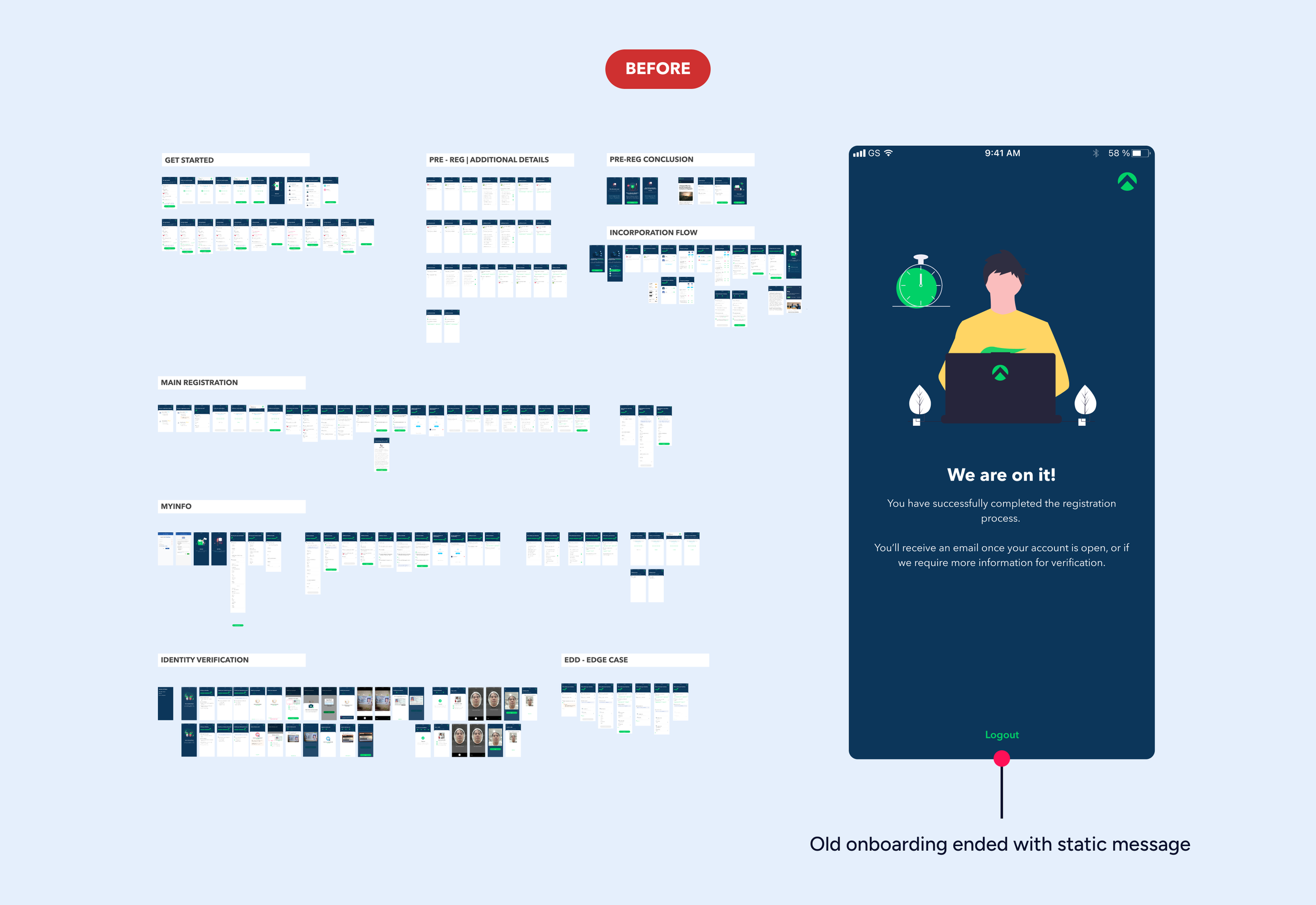
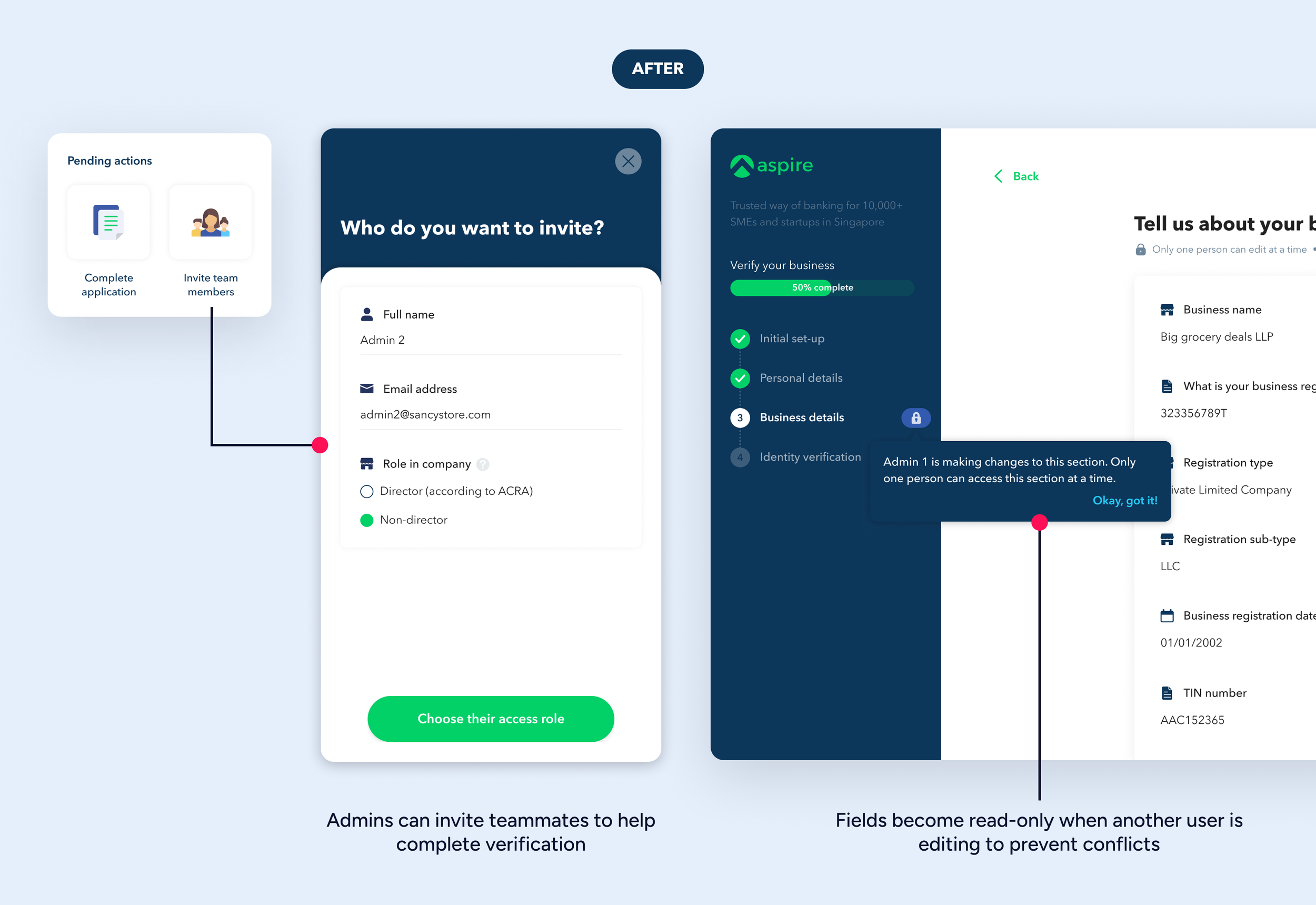
Users took 1–2 weeks to complete onboarding. Major drop-offs occurred during selfie-based KYC steps, especially on desktop. Business KYB steps often required multiple people, but the app only supported a single user. The static final screen gave no reason to return, relying entirely on CX follow-ups.
What I Did
Audited the funnel using analytics and replays to pinpoint key drop-offs
Interviewed drop-off users to uncover reasons: missing documents, confusion about roles, webcam issues
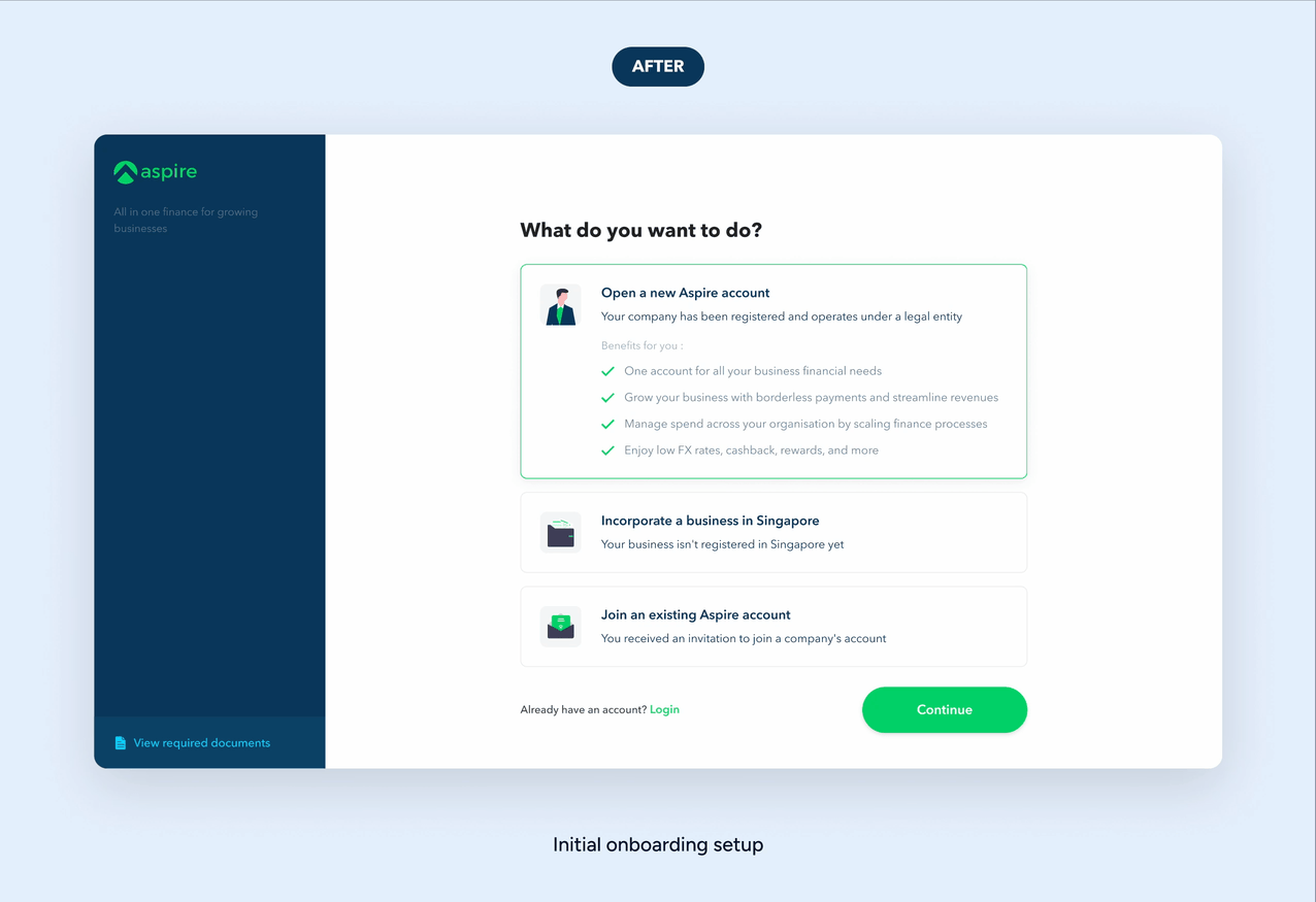
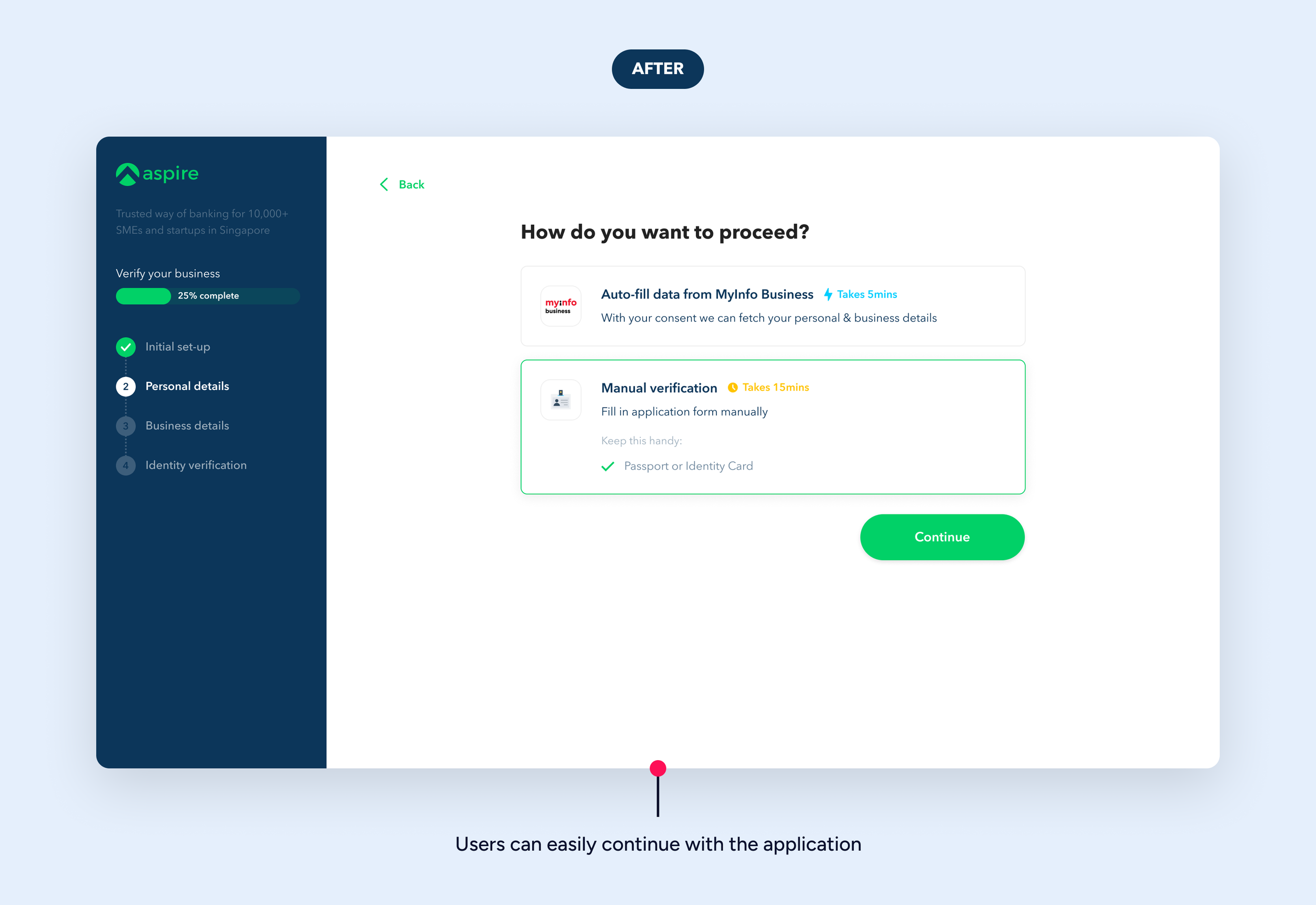
Designed a modular, role-based onboarding flow with inline help
Added a collaborative application feature, so two admins could fill info in parallel
Enabled read-only mode on concurrent pages to prevent accidental overrides
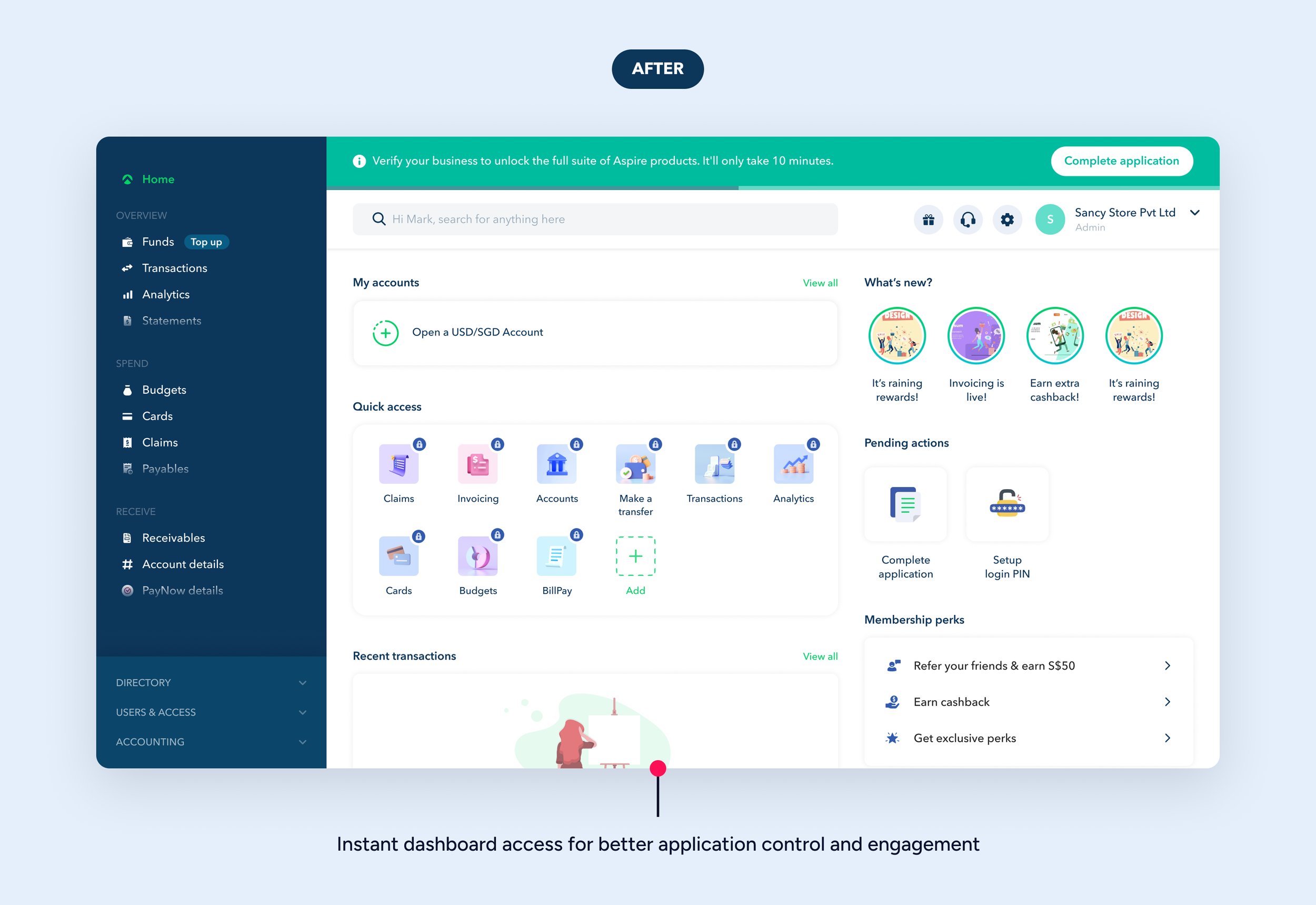
Replaced the static completion screen with a live status tracker + dashboard preview
Impact
Reduced onboarding time from ~2 weeks to 3–4 days (sometimes within a day)
Provided instant dashboard access, increasing return logins
Eased CX load with fewer follow-ups
Design foundation reused across KYC and vendor onboarding flows
Project 2
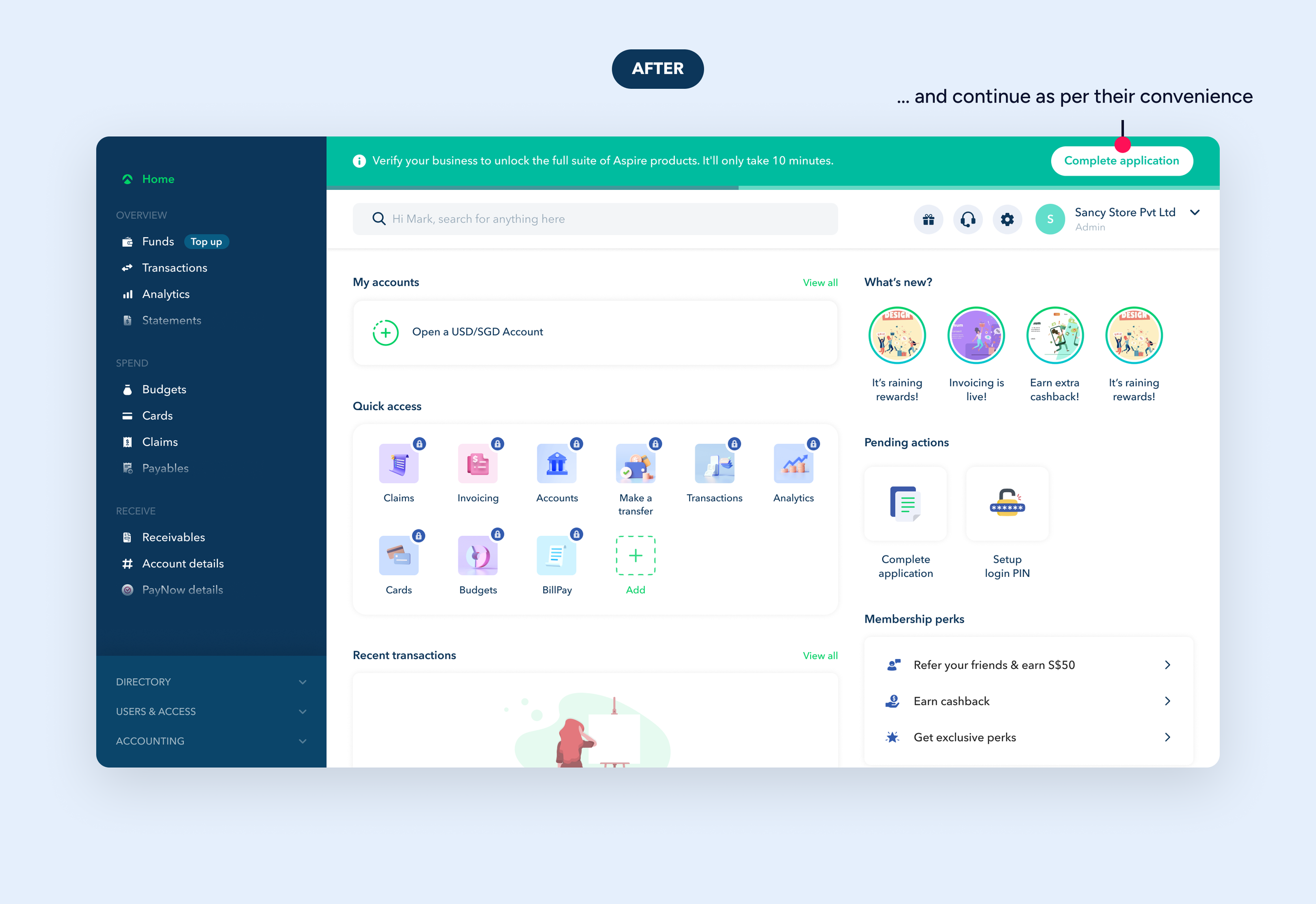
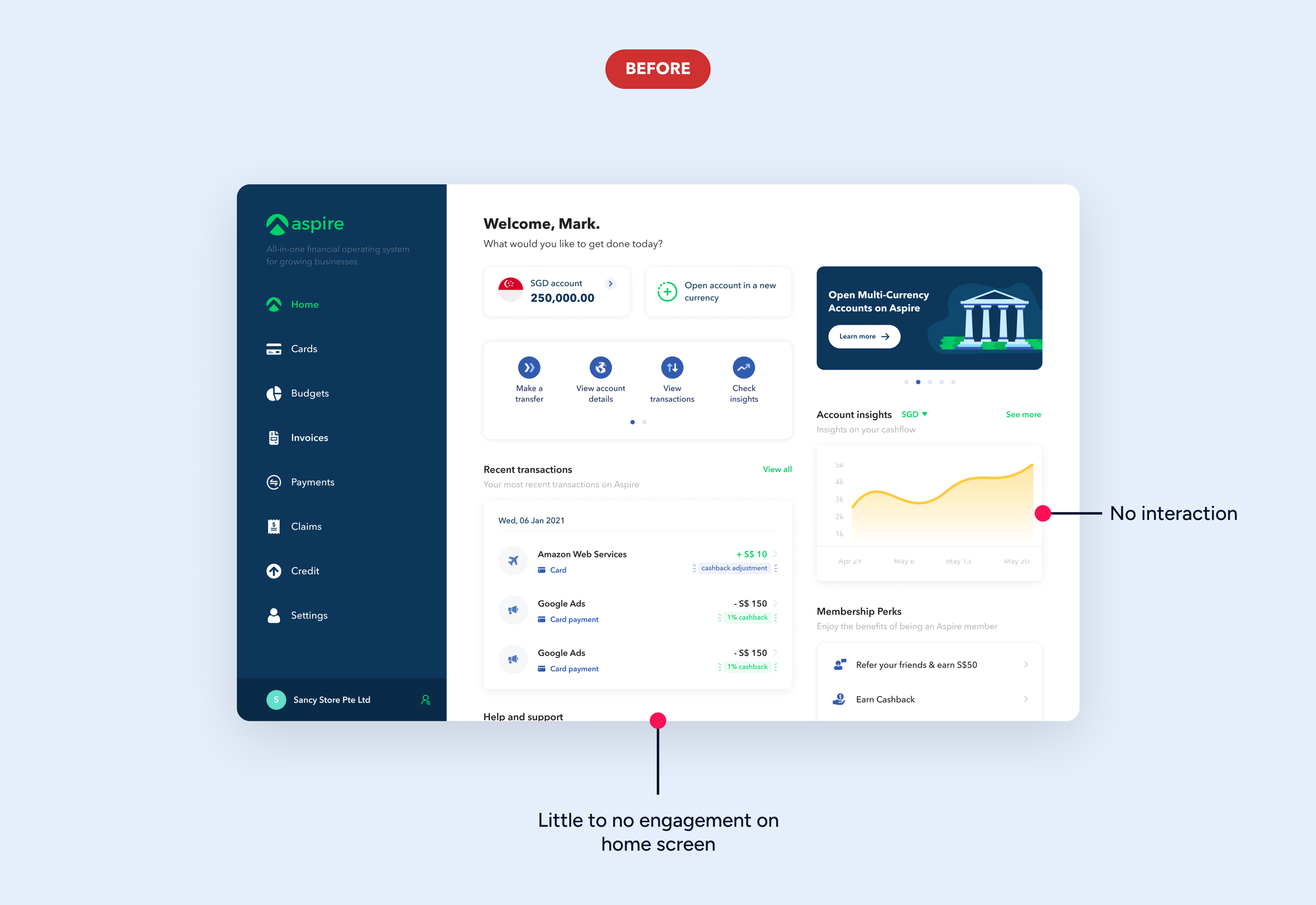
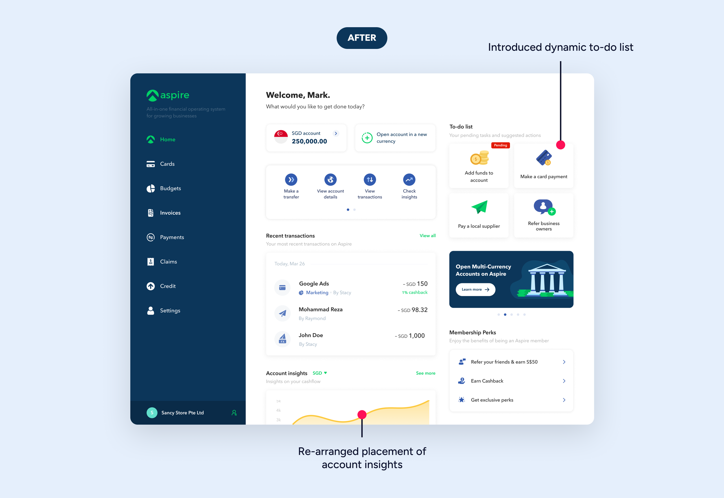
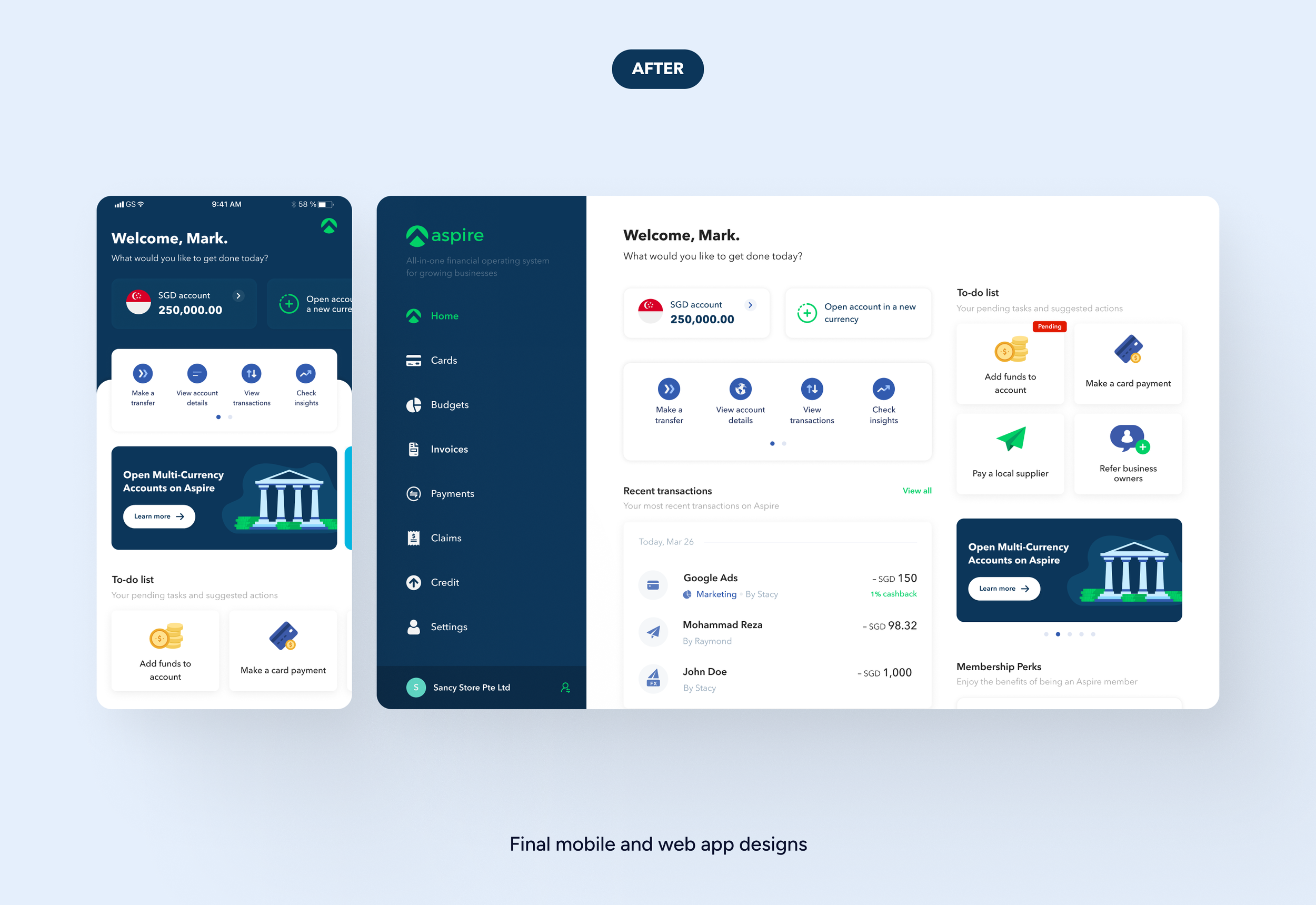
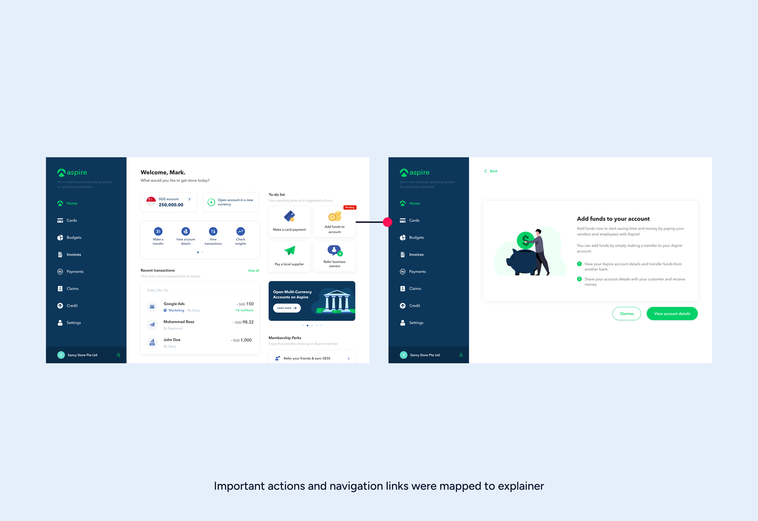
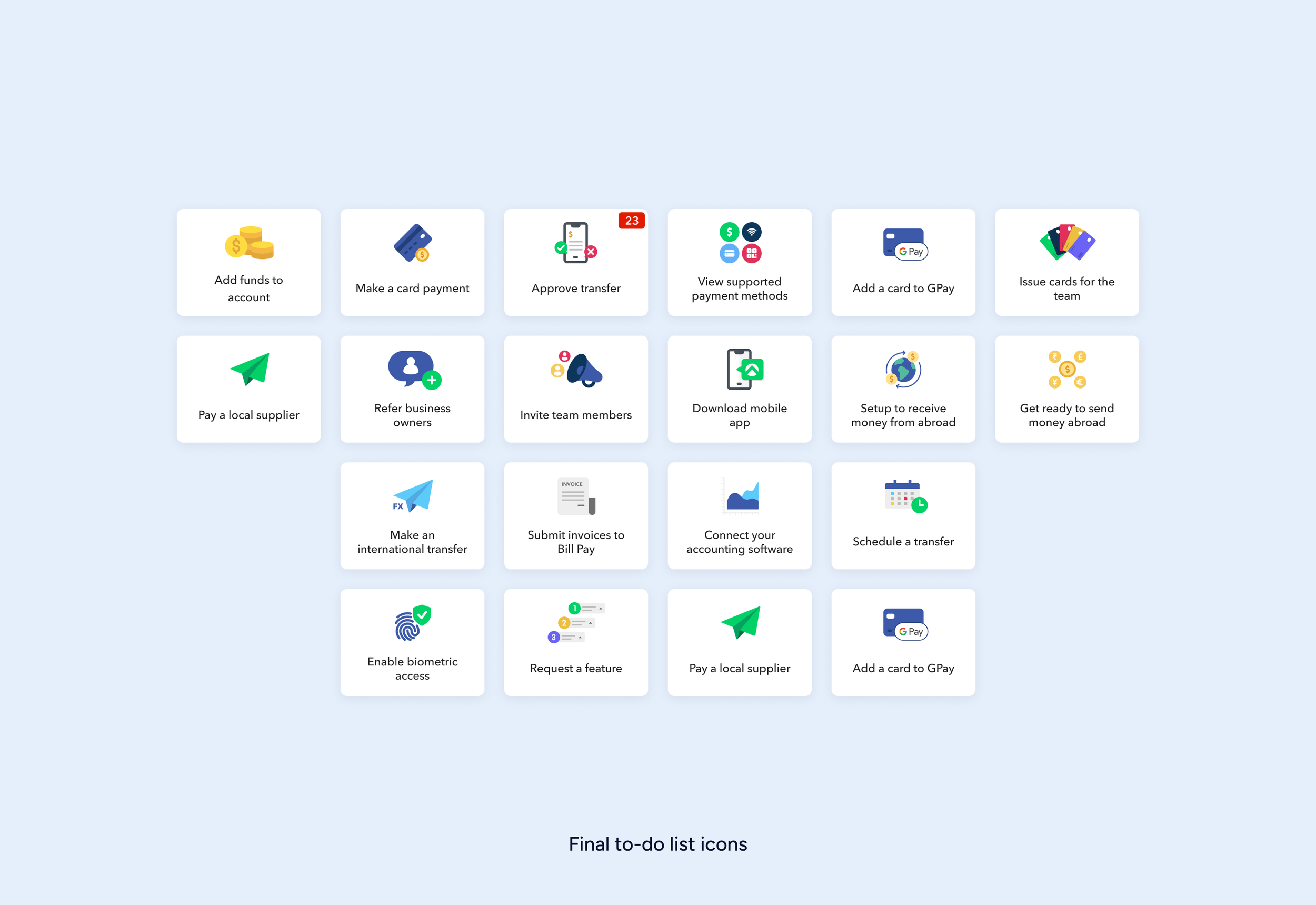
🏠 Homepage & To-do Lists
Problem
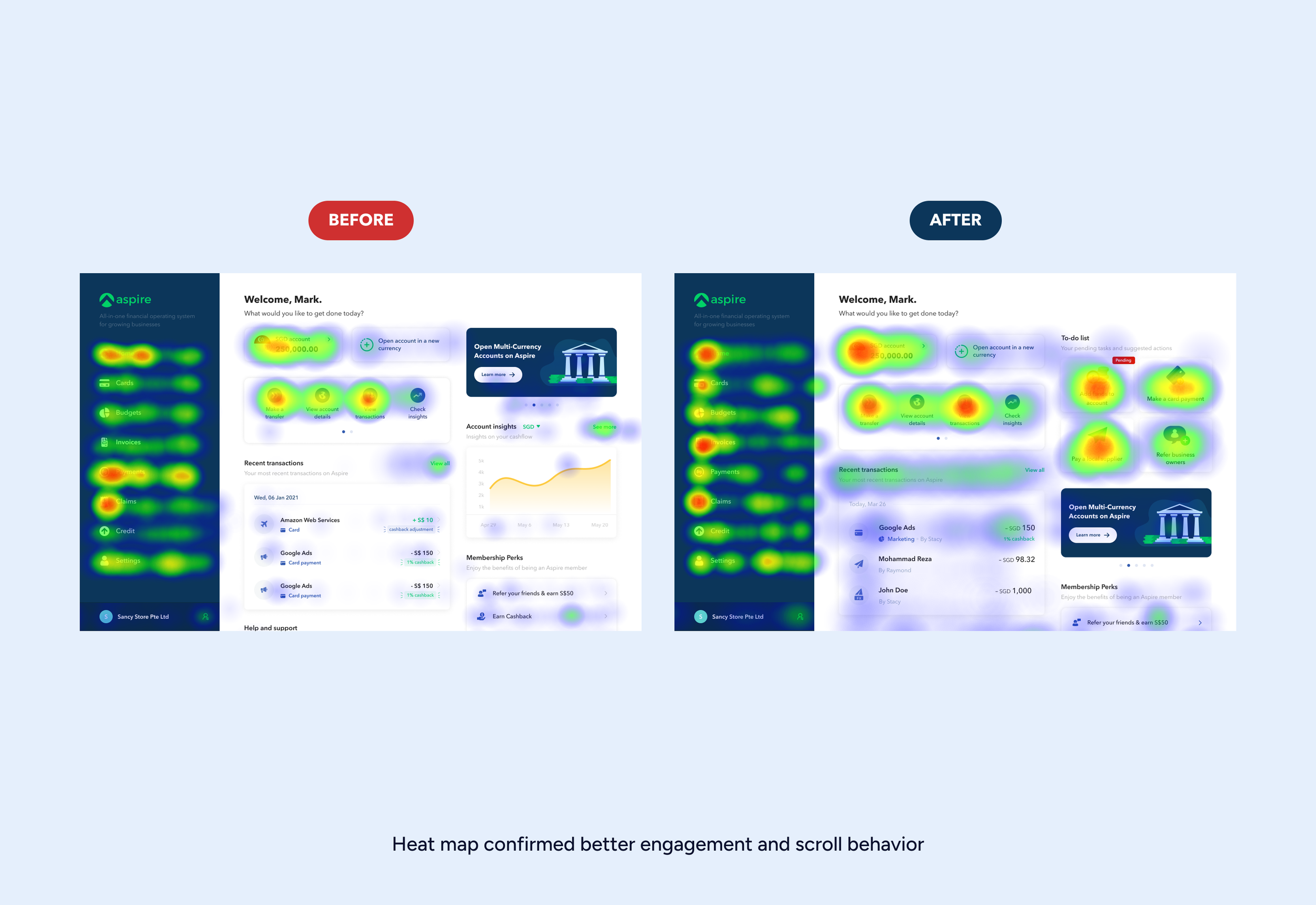
Aspire’s homepage lacked structure. Users didn’t know what to do next, and often missed key features unless hand-held by a CSM. Heatmaps showed low scroll depth, low CTA clicks, and repeated bounce backs.
What I Did
Conducted user journey audits and heatmap reviews
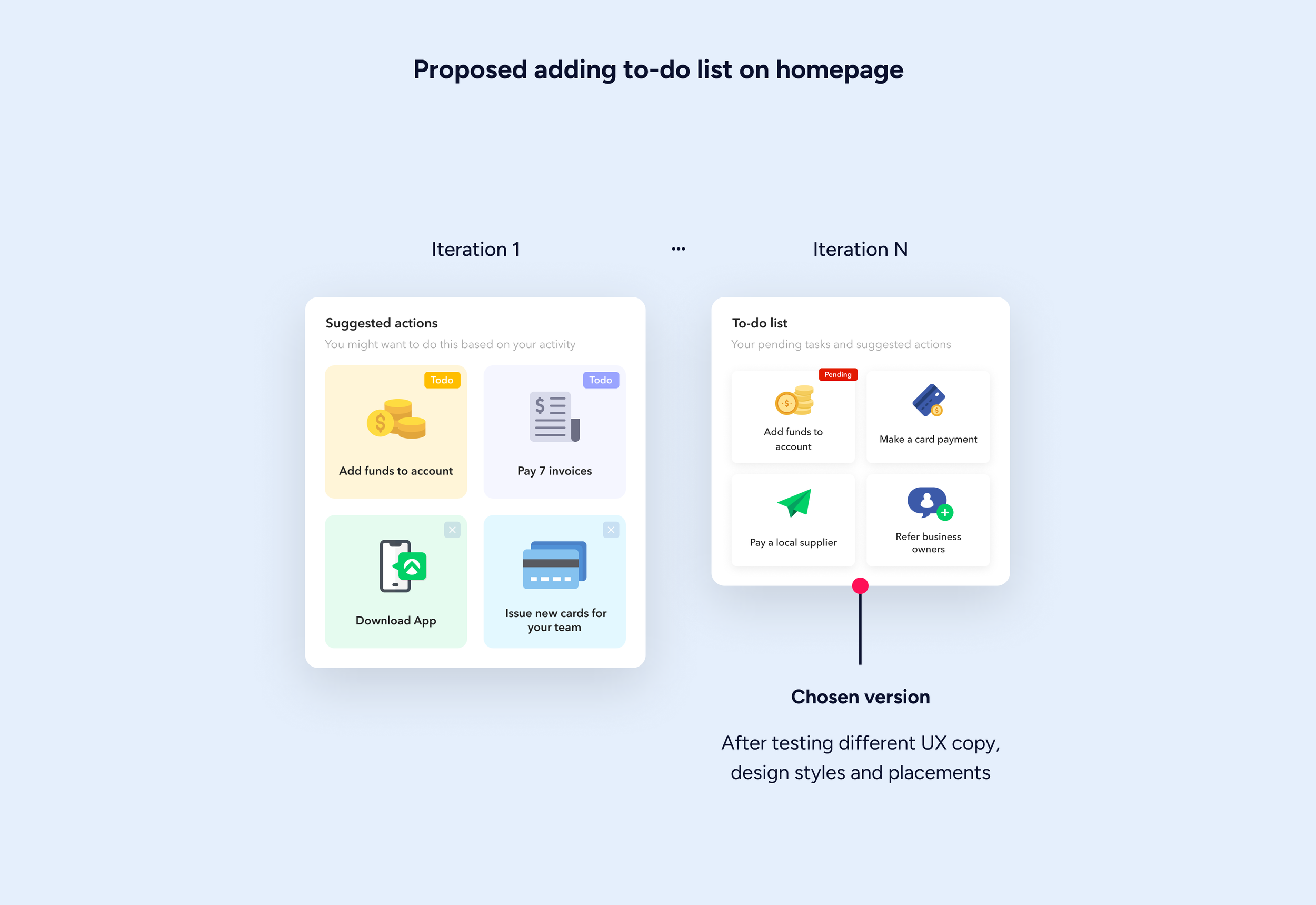
Introduced a smart To-Do list that surfaced tasks by priority and context
Embedded in-context feature explainers for modules like Bill Pay and Budgets
Made homepage modules adaptive to user lifecycle (e.g., “Activate card” shown only to new users)
Partnered with CX to align onboarding and post-signup triggers
Impact
26% increase in feature adoption
Higher scroll depth and module interaction
Support tickets for onboarding queries dropped noticeably

Project 3
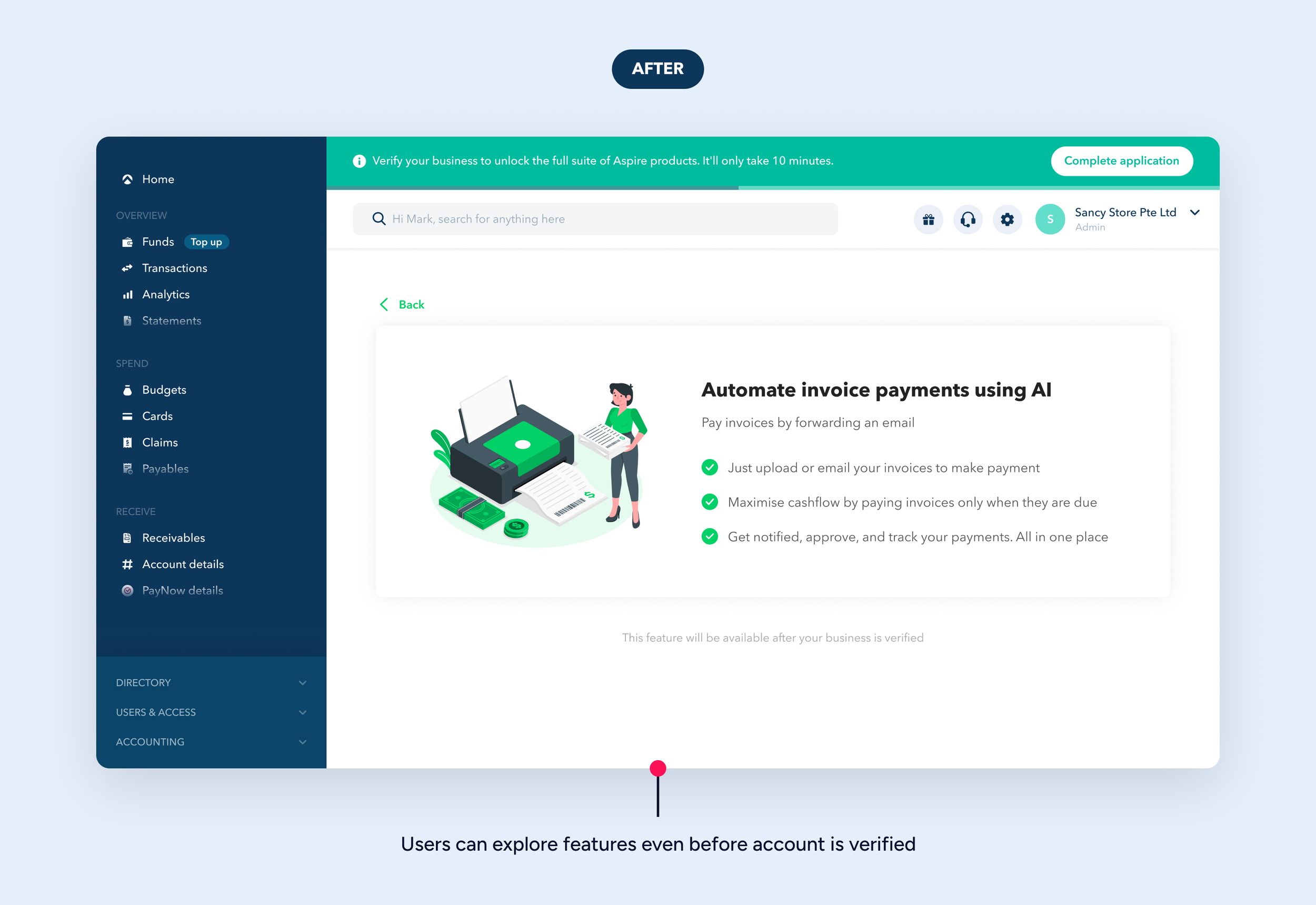
🧾 Bill Pay Launch
Problem
Users had to manage vendor invoices outside Aspire, missing a major opportunity to centralize spend. Adding Bill Pay could drive retention, increase engagement, and give Aspire a competitive edge in B2B fintech.
What I Did
Designed flows for uploading, forwarding invoices, OCR parsing, and payment scheduling
Created reviewer flows and notification systems for approvals
Scoped fallback logic with backend and compliance teams
Designed responsive web + mobile experiences with edge case handling
Impact
Successfully launched in pilot
Gradually rolled out to all users
Still live as part of Aspire’s core offering: 🔗 Product Link
Project 4
💰 Launching Usage-Based Pricing Plans
Problem
As we kept on adding new features, we needed to shift Aspire from transactional fees to usage-based, predictable, recurring revenue through a thoughtful pricing and subscription model.
What I Did
Collaborated with product and leadership to explore pricing options
Designed flows for plan selection, upgrade prompts, usage limits, and trial handling
Integrated pricing selection into onboarding
Covered edge cases like overages, auto-renewals, and downgrades
Impact
Enabled switch to recurring billing
Supported 12+ pricing experimentation and iteration
Upsell flows aligned with feature unlocks and lifecycle stages
Project 5
✨ Micro UX Wins
Why It Mattered
Even small frictions in daily workflows can lead to user frustration and a lack of trust. Fixing these minor, but important, issues was crucial for enhancing the day-to-day product experience and showing our commitment to quality and polish.
What I Did
Multi-business switcher → Seamless transitions between accounts
Preferred Name support → Localized name preferences (e.g., Chan Kong-sang → Jackie Chan)
Granular notification settings → Role-based email/SMS preferences
Login + password reset UX → Fewer drop-offs across sessions/devices
Impact
These were small fixes, but they had a big impact on polish, trust, and NPS scores
The difference it made
Product
Cut onboarding time by 75% - from ~2 weeks to 3–4 days (sometimes within a day)
Boosted feature adoption by 26%
Enabled Aspire’s shift to monetization
Team
Freed up CX bandwidth by reducing manual follow-ups
Contributed to hiring & mentoring as the team grew from 4 to 12 designers
Process
Advocated and ran groundwork for Design System adoption
Led the transition from Adobe XD to Figma for better collaboration
Flagged and resolved licensing issues across design assets and mobile font use
It’s rare to find someone who blends product thinking, design craft, and business impact the way Uday does. At Aspire, he led several high-impact projects that improved both user experience and engagement. He was also instrumental in shaping our design team culture as we grew from a scrappy few to a well-structured org.
Hammad Jilani, Head of design, aspire

What I learned
⏱️ Speed ≠ shortcuts
Working in lean sprints taught me how to prioritize and align quickly—while still delivering clarity and polish.
💵 Monetization UX = business understanding
Pricing isn’t just UI—it’s value perception, timing, and trust.
🥹 User feedback > Data
Personalization features like Preferred Name stemmed from a user’s frustration when support team members pronounced the name wrongly. Such things can never be identified just from data.