Doubling a B2B auction platform's online sales to $300M through strategic UX changes
Role
Senior Product Designer
Team
Cross-functional (40+ members, 3 countries)
Duration
Jul 2021 – Sep 2022

🚀 TL;DR
I redesigned key experiences for a leading auction platform used by 100K+ users daily, including homepage, bidding widget, signup flow, and mobile access. The outdated UX led to friction, missed bids, and high drop-offs.
Through strategic fixes, we doubled online sales to $300M/quarter, increased signups by 1.5K/month, and improved platform consistency without disrupting operations.
How it started
I kicked things off by understanding how people used the platform, what blocked conversions, and where trust broke down. I started uncovering problem areas through -
User research
Alongside the user research report shared by my colleague, I explored the platform like a new user to identify pain points and areas for improvement.
Data analysis
I used Google Analytics and conversion funnels to identify trends and patterns in user behaviour.
Heuristic evaluation
I evaluated the website and seller tools for usability and accessibility issues.

The challenge
The platform, online since 2001, had years of ungoverned UI changes, leading to inconsistency, high drop-off rates, and negligible mobile usage.
The core challenge was to strategically modernize the user experience and boost revenue without breaking the workflows for existing power users. After an initial analysis, I focused on four key areas.
Planning the roadmap
We chose 4 key areas of improvement based on the effort and ROI estimates.
This started 3 Quarter long journey—strong collaboration between designer, leaders, ~30 Developers across 3 countries & QA Team during the implementation.
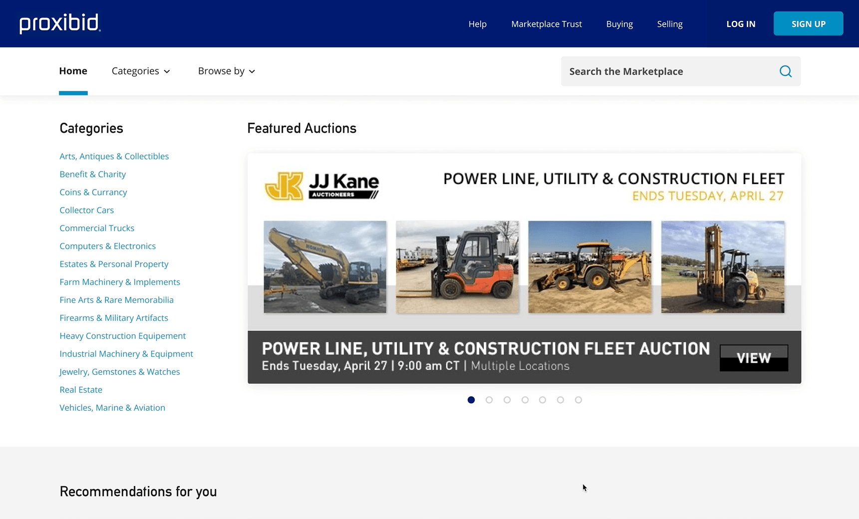
📱 Mobile Readiness & Optimisations
Why It Mattered
Only 4% of users were using mobile due to poor usability. The homepage had no hierarchy or guidance, leading to confusion and underutilized features.
What I did:
Used heatmaps and behavioral analytics to identify drop-offs and priority zones
Chose a Material UI React framework to ensure scalable, dev-aligned design
Prioritized key flows and designed mobile-first layouts
Impact
Significant increase in time-on-site on mobile
Opened up access to a new segment without full revamping
Created a scalable foundation for future modular feature rollouts
🖥️ Design System Modernization
Why It Mattered
The product had years of ungoverned UI changes, leading to inconsistency and redundant components. Developers were wasting time resolving design misalignment.
What I Did
Audited UI usage across flows and devices
Created a visual language and component library in Figma
Shared functional specs with developers in India, the U.S., and Europe
Designed flexible building blocks that were easy to implement
Impact
Reduced front-end dev handoff issues
Improved visual consistency across the product
Accelerated feature shipping velocity across teams

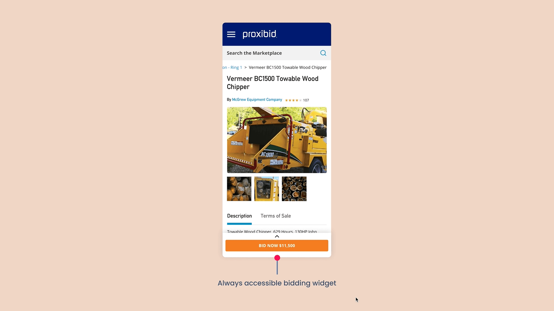
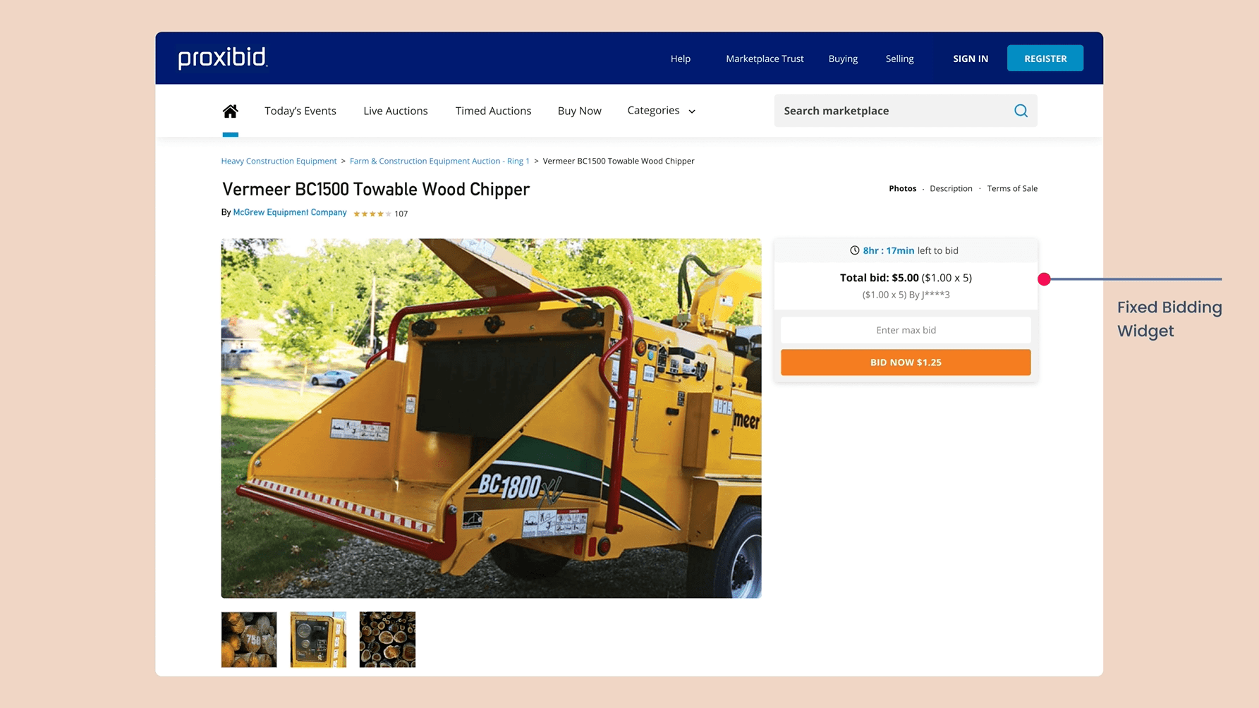
⏱️ Bidding Widget Redesign
What I found
The bidding UI processed millions of bids per month but had over 10 unclear states, leading to user errors and hesitation during high-stakes moments.
What I did
Mapped all widget states and edge cases
Rebuilt the widget with clear zones: timer, bid status, actions
Designed accessible, responsive versions for mobile and desktop
Created high-fidelity Figma prototypes and ran validation tests internally
Impact
Reduced bidding errors and confusion
Increased engagement on high-value items
Contributed directly to 2x online sales


✍️ Signup Flow Optimization
What I found
The original signup form tried to serve both individuals and businesses in one long journey. Drop-off before completion was ~80%.
What I did
Split the flow into role-based paths: Personal vs. Business
Added a progress bar, reduced form fields, and improved tone
Grouped inputs for better scannability
Ran A/B tests on forms using Optimizely
Impact
1.5K+ more signups per month
18% improvement in completion rate
Fewer support complaints during onboarding

Business impact
💸 Online sales doubled from $150M → $300M per quarter
📈 Organic traffic grew 2.5× through improved flow clarity and mobile usage
🧑💻 1.5K+ monthly signups after flow optimization
Online sales doubled to $300mn per quarter in just 9 months. The platform soon got acquired.

Uday deftly managed the balance between what worked best for users and what was feasible for developers—an ability I’ve found rare and incredibly valuable. His curiosity, collaborative nature, and product intuition made him a key asset across teams.
Steve Berry, VP of Product, Proxibid
What I learned
Modernizing legacy systems is a negotiation
You need to ship strategically without breaking what's already working.
Confidence = conversion
Simplifying high-pressure moments like bidding led directly to revenue gains.
Design systems reduce chaos at scale
Consistency & shared components unlocked speed across international teams.